
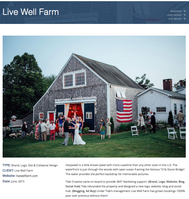
New Client - Live Well Farm
/
Today's couples are connecting to your business on all types of devices. How your website appears on a smart phone, tablet or desktop will determine if you get their attention - this can be a huge opportunity, or it can be where you lose business to a competitor.
Are your ideal clients finding you on a Galaxy Tablet, iPhone 6 Plus, or their work computer? A responsive website will reformat images and copy, making it easily accessible and viewable on different devices - regardless of screen size. Savvy web developers are even able to cater the experience to the specific device sizes (fine-tuning what is seen on a mobile vs. a tablet, for example), further driving a great user experience.
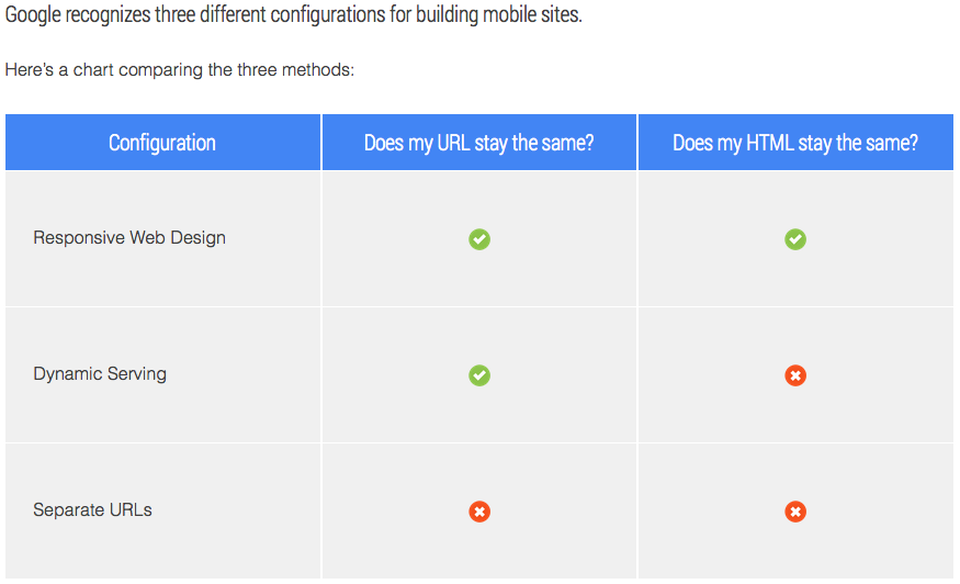
We've mentioned this before, but it's worth repeating: Google favors responsive design! Responsive web design serves the same HTML code on the same URL regardless of the users’ device (desktop, tablet, mobile, non-visual browser), but can render the display differently (i.e., “respond”) based on the screen size. Responsive design is Google’s recommended design pattern.
 Your potential clients should be able to look at your brand any time, any place and on any device. Allow us to create a web presence for you with a responsive site that will cater to each of those experiences and represent you the best! Booking that ideal wedding client takes more than just being good at what you do today - you must also present yourself in a manner that creates trust online...we can do that for you! Contact us for a free consultation.